Introduction
Ever landed on a website that just felt… right? You didn’t have to think. Everything worked, looked clean, and guided you exactly where you needed to go. That’s not luck. That’s design done well. And behind every well-built site are seven basic web design principles you can’t afford to ignore.
Why Web Design Principles Matter Today
Web design is not just about aesthetics. It’s about performance, trust, and conversion. A user decides within 50 milliseconds whether to stay or leave a website. Poor design causes bounce. Good design builds trust. Whether you’re running a blog, eCommerce site, or service page, these design principles impact how users feel and act.
For businesses, especially online-first or mobile-heavy ones, design is a silent salesperson. It builds your credibility without saying a word. If users can’t find what they want or feel overwhelmed visually, you lose leads.
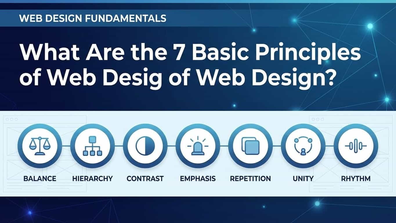
The 7 Basic Principles of Web Design
1. Balance
Balance is how you distribute elements like text, images, and whitespace to avoid visual tension. Think of your website like a scale. If one side is too heavy (too much content or imagery), the user feels it.
There are two types of balance:
- Symmetrical balance: Elements are mirrored. It feels clean and formal.
- Asymmetrical balance: Different elements are balanced through contrast. Feels modern and dynamic.
Tip: For business sites, symmetrical layouts often convert better because they feel more structured.
2. Contrast
Contrast draws attention. Without it, your content blends together. Contrast applies to colors (like white text on a black background), font sizes, image shapes, and spacing.
Use contrast to:
- Highlight CTAs
- Create visual interest
- Improve readability
Common Mistake: Using too many colors. Stick to 2–3 main colors, and make contrast purposeful.
3. Emphasis
Not all elements are equal. You want users to see certain things first — your headline, CTA button, or signup form. That’s where emphasis comes in.
You can use:
- Larger fonts
- Bold colors
- Unique shapes
- Icons
But don’t overdo it. If everything stands out, nothing does.
Pro Secret: Use the F-pattern or Z-pattern layout. They follow natural eye movement and help guide focus.
4. Consistency
Consistency builds trust. If your homepage uses round buttons and serif fonts, your product pages shouldn’t use square buttons and sans-serif fonts. This also applies to:
- Navigation menus
- Icons
- Spacing
- Voice/tone
A consistent design reduces cognitive load. It makes users feel safe and comfortable.
Quick Check: Visit each page of your site and look for design mismatches.
5. Unity
Unity makes all parts of your site feel like they belong together. It’s the visual glue.
This includes:
- Consistent use of color, fonts, and images
- Grouping related content together
- Using grids and alignment properly
Unity creates flow — the feeling that everything fits.
Visual Trick: Use repeated design elements, like icons or patterns, to build visual unity.
6. White Space (Negative Space)
White space isn’t wasted space. It’s breathing room. It improves readability, focus, and user experience.
Benefits:
- Makes content digestible
- Improves CTA visibility
- Adds elegance
Too much content squeezed together feels like clutter. Add margins, padding, and space between sections.
Golden Rule: Let elements breathe. More space equals more clarity.
7. Alignment
Good alignment = easy navigation. Misaligned elements confuse users and feel unprofessional.
Proper alignment:
- Groups related items visually
- Directs the eye
- Creates a clean structure
Use a design grid or guides when building pages. Even spacing between lines, consistent column widths, and centered headlines go a long way.
Design Tip: Left alignment works best for body text. Center alignment is good for titles.
Common Mistakes in Applying Design Principles
- Overloading the homepage with too much text
- Inconsistent fonts and button styles across pages
- No clear hierarchy — everything is the same size or color
- Ignoring mobile users — elements don’t resize or stack properly
Avoiding these issues helps retain users and encourages them to explore.
How to Apply These Principles to Your Website
You don’t need to be a designer. Here’s how to start:
- Use website builders with clean templates (like Wix, Webflow, WordPress)
- Choose 2 fonts, 2–3 colors, and stick with them
- Use white space to separate sections
- Check alignment using grid overlays
- Audit your site monthly to spot inconsistencies
Bonus Tip: Ask a friend to use your site without instructions. Watch where they get stuck.
Final Thoughts on Design That Works
You don’t need to be a graphic wizard to make a solid website. You just need to follow the basics:
- Balance the layout
- Use contrast wisely
- Highlight the right stuff
- Keep it consistent
- Make things feel unified
- Don’t fear white space
- Align like a pro
These aren’t suggestions. They’re foundations.
If your website isn’t working for your business, it might not be your offer — it could be your design. Time to take a step back, review your pages, and fix what’s holding you back.