
Your website has 0.05 seconds to make an impression.
That’s 50 milliseconds. Faster than a blink.
In that sliver of time, visitors decide: “Do I stay?” or “Do I bounce?”
And what drives that split-second decision? Your web design.
Not your logo. Not your copy. The design.
Here’s the reality: 94% of first impressions are design-related. And 88% of users won’t return after a bad experience. If your site is slow, confusing, or ugly, you’re hemorrhaging potential customers.
Good web design isn’t about looking pretty. It’s about guiding users, building trust, and driving action.
This article breaks down the 5 golden rules that separate winning websites from forgettable ones. These aren’t opinions or trends—they’re proven principles backed by user behavior research and conversion data.
Let’s dive in.
What Makes a Web Design ‘Good’?
Good web design is invisible.
Users don’t notice it. They just feel it. Everything works. Everything makes sense. They find what they need without thinking.
Bad web design? That’s painfully obvious. Slow loading. Confusing menus. Buttons that don’t look clickable. Walls of text with no breathing room.
Here’s the simple definition:
Good web design combines usability (easy to use), aesthetics (pleasing to look at), and functionality (actually works).
But here’s where people get confused.
Design vs Experience
Design is what it looks like colors, fonts, images, layout.
Experience is what it feels like. How fast it loads. How easy it is to navigate. Whether you can find the checkout button.
You can have a gorgeous site that’s impossible to use. That’s bad design.
You can have a plain site that converts like crazy. That’s good design.
The 5 golden rules balance both. They make your site beautiful and functional.
Let’s break them down.
The 5 Golden Rules of Web Design
1. Keep It Simple
Simplicity wins.
Every. Single. Time.
Your visitors aren’t here to admire your design skills. They’re here to solve a problem. Buy something. Find information. Get out.
The more stuff you throw at them, the harder their brain has to work. And when brains work too hard, they quit.
Minimalist layouts improve readability and ease of navigation.
Strip away everything that doesn’t serve the user’s goal.
Remove extra widgets. Cut unnecessary animations. Delete that third sidebar.
Use whitespace. It’s not wasted space—it’s breathing room. It lets your content stand out.
Avoid clutter, unnecessary elements, over-design.
Every element should have a purpose. If it doesn’t help the user or support your goal, delete it.
Too many fonts? Pick two. Too many colors? Stick to three or four. Too many CTAs? Choose one primary action per page.
Example comparison: Clean vs Crowded Layout
Crowded site:
Five banner ads. Blinking text. Three pop-ups before you scroll. Fifteen menu items. Autoplay video. Social feeds in the sidebar.
Clean site:
One clear headline. One main CTA. Three navigation links. Plenty of whitespace. Smooth scroll.
Which one feels trustworthy? Which one makes you want to stay?
Simplicity isn’t lazy. It’s strategic.
2. Prioritize User Experience (UX)
Here’s the brutal truth: nobody cares about your website.
They care about themselves. Their problem. Their goal. Their time.
Your job? Make it stupid-easy for them to get what they came for.
User-centric navigation, clear structure, predictable behavior.
Navigation should be obvious. No hidden menus. No confusing labels.
Users expect your logo to link to the homepage. They expect a menu at the top or a hamburger icon on mobile.
Don’t reinvent the wheel. Predictability builds trust.
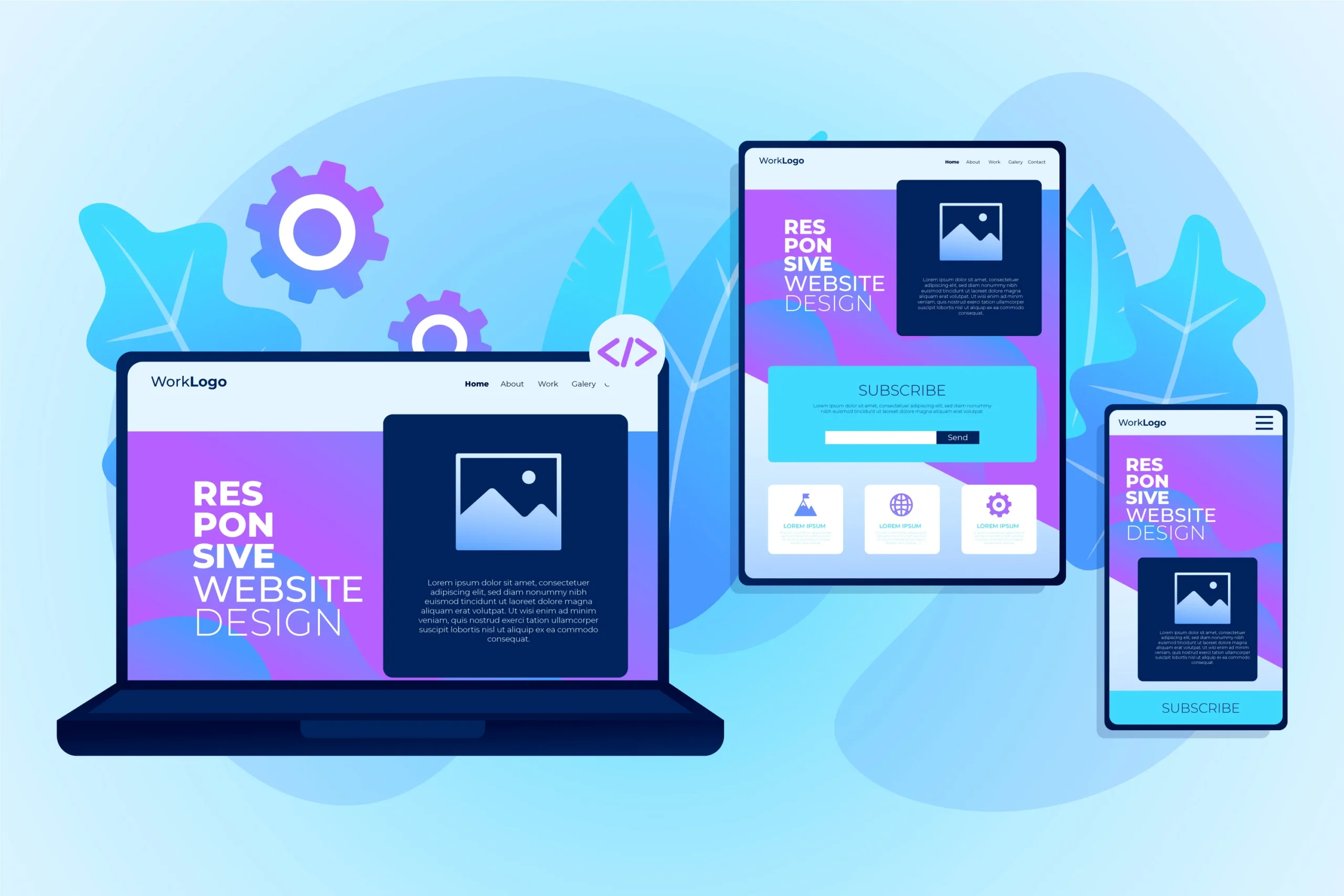
Mobile responsiveness + accessibility.
Over 60% of web traffic is mobile. If your site doesn’t work perfectly on phones, you’re alienating most of your audience.
Test on real devices. Make sure buttons are tappable. Text is readable without zooming.
Accessibility matters too. Use proper contrast for text. Add alt tags to images. Make sure your site works with screen readers.
Good UX means everyone can use your site—no exceptions.
Smooth journey from landing to conversion.
Think of your site as a path. Landing page → product page → checkout.
Every step should be clear. No dead ends. No confusion. No friction.
If users have to think, you lose them.
Real use case example:
Imagine you land on an online course site. The homepage has a giant “Start Learning” button. You click it. You see three course options with clear descriptions. You pick one. The checkout page has two fields: email and payment. Done in 90 seconds.
That’s good UX. No guesswork. No wasted time. Just results.
3. Visual Hierarchy & Layout Structure
Your users don’t read your site. They scan it.
Their eyes jump from headline to image to button. They’re hunting for what matters.
Visual hierarchy guides their attention. It tells them what to look at first, second, and third.
Guide attention using size, color, spacing, typography.
Size: Bigger = more important. Your headline should dominate. Your CTA should be impossible to miss.
Color: Bright, contrasting colors draw the eye. Use them for buttons and key actions.
Spacing: Group related items together. Separate unrelated items with whitespace.
Typography: Bold headlines. Regular body text. Italics for emphasis (sparingly).
Headings, CTAs, product highlights placement.
Your H1 should be at the top. Crystal clear.
Your CTA should be above the fold and at the end of the page.
Product highlights or key benefits should be in the first screen. Don’t bury your best stuff.
F-shaped/Z-pattern scanning explanation.
Eye-tracking studies show users scan in predictable patterns.
F-pattern: Common on text-heavy pages. Eyes scan the top, then down the left side, with shorter scans across.
Z-pattern: Common on landing pages. Eyes move from top-left to top-right, then diagonally down to bottom-left, then across to bottom-right.
Design with these patterns in mind. Place your most important info along these paths.
How hierarchy improves engagement.
When users can instantly spot what matters, they engage more.
Bounce rates drop. Time on page increases. Conversions rise.
Clear hierarchy removes friction. And friction kills sales.
4. Ensure Fast Loading Speed
Speed is a feature.
Actually, it’s the feature.
A slow site isn’t just annoying. It’s a business killer.
Site speed affects bounce rate, SEO, conversions.
53% of mobile users abandon pages that take longer than 3 seconds to load.
Even a 1-second delay can reduce conversions by 7%.
Google uses page speed as a ranking factor. Slow sites rank lower. Period.
Image optimization, CDN, caching.
Images are usually the biggest culprit. Compress them. Convert to WebP. Use lazy loading so images only load when users scroll to them.
A CDN (Content Delivery Network) stores copies of your site on servers worldwide. Users load from the closest server. Faster load times globally.
Caching stores static versions of your pages. Return visitors load faster because their browser remembers the site.
Lightweight code and resource management.
Bloated code slows you down. Minify CSS and JavaScript. Remove unused plugins.
Avoid heavy page builders if possible. Clean, hand-coded sites almost always load faster.
Audit your site with Google PageSpeed Insights or GTmetrix. Fix what’s broken.
Quick stat: 53% users leave pages loading over 3s.
Three seconds. That’s your window.
If you’re not loading by then, you’ve already lost half your visitors.
Speed isn’t optional. It’s survival.
5. Use Consistent Branding
Your brand is a promise. Your website should reinforce it on every single page.
Consistency builds trust. Inconsistency breeds confusion.
Colors, fonts, tone, image styles remain uniform.
Pick your brand colors. Use them everywhere. Same blue. Same orange. Same accent color.
Pick your fonts. Stick to them. One for headings. One for body text. Maybe one for CTAs.
Your tone should match across pages. If your homepage is casual and friendly, your about page shouldn’t sound corporate and stiff.
Image styles matter too. If you use clean, bright lifestyle photos on one page, don’t switch to dark, moody stock photos on the next.
Builds trust and recognizability.
When everything looks and feels cohesive, users relax. They know where they are. They trust you.
Inconsistent branding makes you look amateur. Different people built different pages and never communicated with each other.
Examples of strong brand identity in UI.
Apple: Clean. Minimal. White space. Premium feel everywhere.
Mailchimp: Playful yellow. Friendly illustrations. Conversational copy.
Stripe: Modern gradients. Technical but approachable. Consistent purple accents.
Each brand has a signature style. You know it instantly.
Visual brand consistency increases retention.
When users recognize your style, they remember you. They come back. They recommend you.
Brand consistency isn’t vanity. It’s a competitive advantage.
Bonus Best Practices (Optional Add-On Section)
The 5 golden rules cover the foundation. But here are a few extras that separate good sites from great ones.
Mobile-First Design Approach
Design for mobile first. Then scale up to desktop.
Why? Most traffic is mobile. And mobile forces you to prioritize ruthlessly.
If it works on a small screen, it’ll work everywhere.
Clear and Visible CTAs
Your call-to-action shouldn’t blend in. It should pop.
Use contrasting colors. Make buttons big enough to tap easily. Use action words: “Get Started,” “Buy Now,” “Download Free Guide.”
One primary CTA per page. Don’t give users decision paralysis.
High-Quality Visual Content
Blurry images kill credibility. Low-res logos look unprofessional.
Invest in quality visuals. Use real photos when possible. Avoid cheesy stock images.
Video? Even better. But make sure it’s short, relevant, and doesn’t slow your site down.
Accessibility Standards (Contrast, Alt-Text, Keyboard Navigation)
Accessibility isn’t just nice to have. It’s the law in many places.
Use proper color contrast. White text on light gray? Unreadable.
Add alt text to every image. Screen readers depend on it.
Make sure your site works with keyboard navigation. Not everyone uses a mouse.
Regular Updates + Testing for UI/UX Performance
Your site isn’t done when it launches. It’s never done.
Test regularly. Run A/B tests on CTAs, headlines, layouts.
Use heatmaps to see where users click. Use session recordings to watch how they navigate.
Fix bugs. Update content. Keep improving.
Why Following These Rules Matters
These aren’t just design tips. They’re business levers.
Better Engagement and Lower Bounce Rate
When your site is simple, fast, and easy to use, people stick around.
They explore. They read. They engage.
Bounce rates drop. Session duration increases. That signals quality to Google.
Higher Conversions + Improved SEO Performance
Clear hierarchy and strong CTAs guide users to convert.
Fast load times and mobile optimization boost your search rankings.
Better UX = more sales + more traffic. It’s a multiplier effect.
Stronger Trust and Professional Brand Perception
A well-designed site screams “legit.”
A poorly designed site screams “scam” or “amateur.”
Users judge your entire business by your website. Make it count.
Conclusion
Here’s the bottom line: web design isn’t about you. It’s about your users.
The 5 golden rules—simplicity, UX, hierarchy, speed, and consistency—guide you to build sites that work for real humans, not just designers.
Keep it simple so users don’t get overwhelmed.
Prioritize UX so they find what they need instantly.
Use visual hierarchy so their eyes land exactly where you want.
Ensure fast speed so they don’t bounce before the page loads.
Maintain consistent branding so they trust you.
Follow these rules, and your site becomes a conversion machine.
Ignore them, and you’re just another forgettable page in a sea of millions.
Design for humans, not designers.
Because at the end of the day, it’s not about winning awards. It’s about winning customers.
Ready to audit your site? Pull it up right now. Check it against these 5 rules. Find what’s broken. Fix it.
